

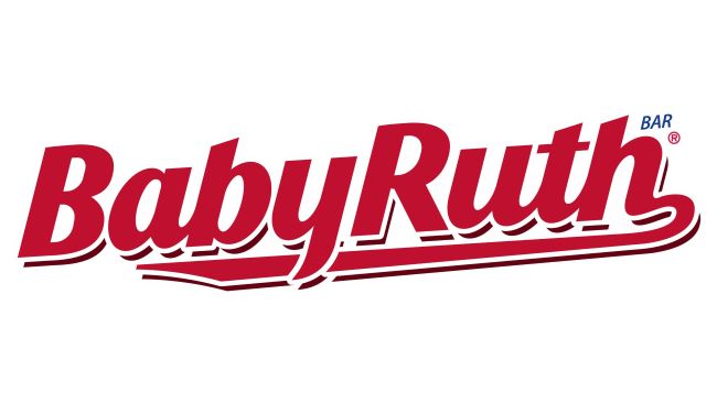
BabyRuth Font
The Baby Ruth Font reflects one of the most iconic typographic styles in American candy history. Its bold, classic serif design has remained nearly unchanged for decades, giving the brand a timeless and instantly recognizable identity. The lettering carries a nostalgic charm that reminds people of childhood treats, baseball games, and generations of snacking memories. With its sturdy forms and traditional detailing, the typeface communicates craftsmanship and quality, perfectly matching the candy bar’s long-standing reputation. I think this style works especially well for projects that want to evoke heritage, Americana, or vintage flavor—it has a warm, dependable feel that stands out without needing modern embellishments.
Ferrero
Ferrero acquired the Baby Ruth brand from Nestlé in 2018. Founded in 1946, Ferrero is a global confectionery leader known for Nutella, Ferrero Rocher, Kinder, and other beloved products sold in more than 50 countries worldwide.