


Campari Font
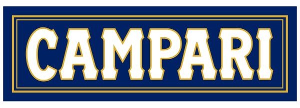
What Font is Used in the Campari Logo?
The Campari logo uses a custom-designed typeface created specifically for the brand, giving it a strong and unmistakable visual identity. The tall, narrow letterforms and bold strokes communicate Italian elegance, confidence, and heritage — perfectly matching Campari’s image as a premium aperitif with a long cultural history. While the original lettering is proprietary, Fairplex Narrow OT Bold comes remarkably close to the official logo style with its condensed proportions and clean, modern structure.
This font captures the same refined yet assertive feeling seen in Campari’s branding. Its vertical emphasis and sharp edges create a striking presence that works well for packaging, advertising, and logo-style typography inspired by Campari’s iconic red label.
About Campari
Campari is a legendary Italian bitter aperitif first created in 1860 by Gaspare Campari in Novara, Italy. Famous for its vibrant red color and complex bittersweet flavor, Campari is made from a secret blend of herbs, fruits, and aromatic plants. Over the decades, it has become a symbol of Italian aperitivo culture and a key ingredient in classic cocktails such as the Negroni and Americano, enjoyed around the world for more than 160 years.
Please make sure to follow the license terms for each font. All fonts provided are free for personal use, while some may also allow commercial use. For details, check the included Read Me file with each download. If you’re uncertain about usage rights, we recommend contacting the font’s creator directly.