


Dead Poets Society Font
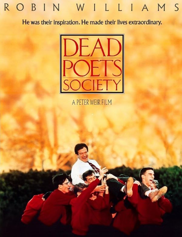
What Font Does Dead Poets Society Use?
The typography featured in Dead Poets Society draws inspiration from Classic Roman, an established serif font that radiates sophistication and scholarly authority—ideal for representing the film’s educational backdrop and profound themes. Its carefully crafted letterforms and harmonious proportions establish a distinguished aesthetic that mirrors the movie’s exploration of literature, mentorship, and self-expression. The design embodies both the academic rigor of Welton Academy and the poetic awakening experienced by the students. This classical approach to typography reinforces the film’s celebration of language and individual thought, creating visual harmony with Peter Weir’s 1989 masterpiece starring Robin Williams as an inspiring English teacher who challenges convention.
Personal-use only. For commercial use please contact owner.
About Dead Poets Society
Dead Poets Society is a 1989 drama film directed by Peter Weir and starring Robin Williams. Set in a conservative boys’ prep school, the movie tells the story of an unorthodox English teacher who inspires his students to think for themselves and embrace the power of poetry and passion.