

Gran Torino Font
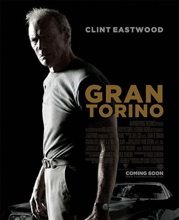
What is the Font in the Gran Torino Poster?
The Gran Torino Font used in the film’s title design is likely Ridley Grotesk Extra Bold or Gotham Black, both bold sans-serif typefaces that convey strength, simplicity, and grit—perfect for Clint Eastwood’s hard-edged drama. Its bold, clean lines mirror the stoic and no-nonsense attitude of Eastwood’s character. The typography doesn’t rely on ornamentation—it’s direct and grounded, just like the story itself. This 2008 drama explores themes of redemption, prejudice, and human connection through a grizzled war veteran’s unlikely friendship with his Hmong neighbors, delivering powerful cinematic storytelling.
Personal-use only. For commercial use please contact owner.