

Jack Daniels Font
Man, I absolutely love the Jack Daniel’s Font! That iconic black label is pure Americana—it’s rugged, authentic, and screams Tennessee whiskey heritage. The combination of bold Victorian lettering with elegant script is just *chef’s kiss*. It’s like the typographic equivalent of a smooth sip of Old No. 7.
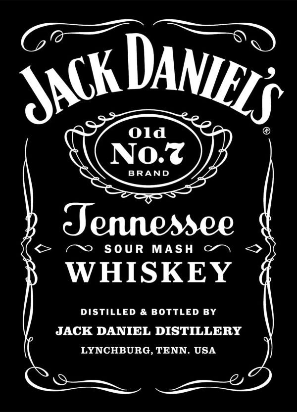
What Font Does Jack Daniels Use?
Here’s the fascinating part—Jack Daniel’s uses TWO fonts (very close matches)! The main “Jack Daniel’s” lettering closely resembles Black No. 7, with that gorgeous condensed Victorian vibe, while “Tennessee” uses something similar to Milk Script—that flowing, elegant script is perfection! Both are premium, but I’ve found excellent free alternatives like LT Carpet Medium and Berkerya that capture that same frontier-meets-Southern-gentleman aesthetic beautifully.
About Jack Daniel’s
Can we just take a moment to appreciate Jack Daniel’s legendary status? Founded in 1866 by Jasper Newton “Jack” Daniel in Lynchburg, Tennessee, this distillery is America’s oldest registered one—and for good reason! What sets it apart is that signature charcoal mellowing process called the Lincoln County Process—it’s what gives Old No. 7 that incredibly smooth character. That iconic square bottle and black label? Instantly recognizable worldwide. I genuinely admire how Jack Daniel’s has maintained its authentic American craftsmanship and Southern tradition for over 150 years while becoming the best-selling whiskey in America. It’s not just whiskey—it’s a piece of American heritage in every bottle!
Remember to respect the licensing agreements for every font. These fonts are offered free for personal projects, though some permit commercial applications as well. Check the accompanying Read Me document with your download for specific details. When unsure about permitted uses, reaching out directly to the font designer is always recommended.