


Kawasaki Font
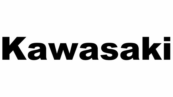
What Font Does Kawasaki Use?
The typography featured in this brand’s emblem hasn’t been formally documented, though the nearest resemblance seems to be Florencesans, a refined and contemporary font crafted by Apostrophic Labs. The polished, aerodynamic character forms of this lettering brilliantly represent the velocity, accuracy, and forward-thinking spirit connected with Kawasaki’s motorcycles and technical mastery.
About Kawasaki
Kawasaki Heavy Industries, launched in Japan in 1896, stands as an international pioneer in motorcycles, aviation technology, and industrial equipment. Recognized for progressive engineering and capability, Kawasaki’s identity symbolizes strength, dependability, and advancement. The striking, current emblem design reflects the corporation’s dedication to acceleration and technical flawlessness.
Remember to respect the licensing agreements for every font. These fonts are offered free for personal projects, though some permit commercial applications as well. Check the accompanying Read Me document with your download for specific details. When unsure about permitted uses, reaching out directly to the font designer is always recommended.