
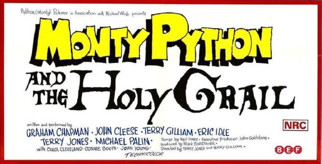
Monty Python and the Holy Grail Font
The Monty Python and the Holy Grail font is as whimsical and offbeat as the comedy itself. Just like the film pokes fun at medieval legends with absurd humor, the title typography looks both historic and ridiculous, balancing old-world charm with a wink of parody. The letters feel exaggerated, almost theatrical—perfect for a film that turns knights, kings, and quests into pure silliness. The style of the lettering is reminiscent of Cloister Black and Caslon Antique, fonts that carry a medieval, Gothic vibe but also lean toward playful drama, echoing the ornate scripts of ancient manuscripts while still being accessible and bold enough for posters and titles.
Download Monty Python and the Holy Grail Font
Designers who look for a Monty Python and the Holy Grail font often choose it to add personality and humor to their projects, working beautifully for parody posters, medieval-themed events, or anything that needs to capture both tradition and comedy. The Monty Python and the Holy Grail font doesn’t just decorate the title—it helps set the mood, telling you right away that this isn’t going to be a serious medieval tale, but a hilarious journey filled with coconuts, knights who say “Ni!”, and plenty of absurdity.
About Monty Python and the Holy Grail
Monty Python and the Holy Grail is a 1975 British comedy film written and performed by the Monty Python comedy troupe: Graham Chapman, John Cleese, Terry Gilliam, Eric Idle, Terry Jones, and Michael Palin. Directed by Gilliam and Jones, the film parodies the Arthurian legend as King Arthur and his knights embark on a absurd quest for the Holy Grail in medieval England. Famous for low-budget ingenuity, quotable dialogue, anarchic humor, and iconic sc


