
My Hero Academia Font
What is the Font Used in My Hero Academia?
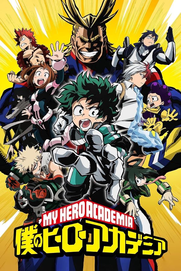
My Hero Academia uses a powerful and bold logo style that matches the anime’s explosive energy and heroic themes. The main lettering is closely based on Futura Now Display Black, a heavy, modern sans-serif typeface known for its strong geometric shapes. However, the iconic letter “M” is different — it appears to be inspired by the rugged and military-style Commando font, giving the logo a more aggressive and action-driven personality.
This mix of clean geometry and gritty detailing creates a visual identity that feels both futuristic and battle-ready, perfectly reflecting the world of heroes, villains, and intense competition. While the official fonts are commercial, a free alternative is available that closely captures the same bold anime look for fan designs, posters, and creative projects.
About My Hero Academia
My Hero Academia is a Japanese anime and manga series created by Kōhei Horikoshi, set in a society where nearly everyone possesses special abilities called “Quirks.” The story follows Izuku Midoriya, a powerless boy who dreams of becoming a hero and eventually earns a chance to join the next generation of legendary fighters. The bold, high-impact typography of the logo reflects the show’s themes of strength, determination, and heroic ambition.
Please make sure to follow the license terms for each font. All fonts provided are free for personal use, while some may also allow commercial use. For details, check the included Read Me file with each download. If you’re uncertain about usage rights, we recommend contacting the font’s creator directly.