

Nescafe Font
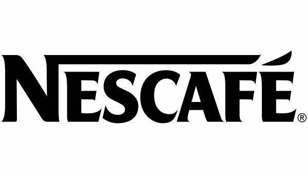
What Font is Nescafe?
The lettering used in the Nescafé logo is based on a custom-designed font created exclusively for the brand. Its bold serif shapes and sharp angles give the wordmark a strong, confident presence that feels both classic and modern. A very close commercial match is Friz Quadrata Pro Bold, which shares the same sturdy proportions and distinctive serif style. Since that font requires a license, a free alternative has also been selected that delivers a similar clean and powerful look.
About Nescafe
Nescafé is one of the world’s best-known coffee brands, launched by Nestlé in 1938. The name blends “Nestlé” and “café,” reflecting its origins and global appeal. Its logo typography is designed to feel bold and approachable, with the accent over the “É” adding a subtle visual cue that suggests warmth and rising steam — reinforcing the idea of a fresh, comforting cup of coffee.
Check out classic alcohol brand lettering with Free Fonts, Baileys Font, Bacardi Font, and Tulsa King Font — and more.