
Spider-Man No Way Home Font
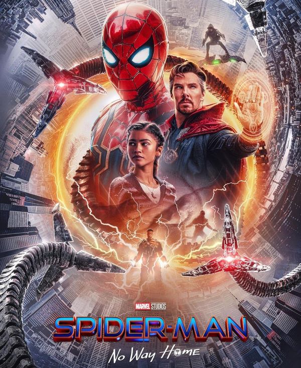
What Typeface is Used in Spider-Man No Way Home?
The Spider-Man: No Way Home Font used in the movie’s title (Spider-Man) is based on Good Times, a sleek and futuristic typeface that fits perfectly with the film’s high-tech and action-packed tone. The font used in the secondary title (No Way Home) is Far From Homecoming. Designed with sharp angles and modern lines, Good Times gives the Spider-Man logo a bold, dynamic look that reflects the film’s mix of sci-fi elements and superhero energy. The clean geometry adds a sense of precision and speed, which suits Spider-Man’s quick reflexes and web-slinging style. This typography beautifully captures the essence of the multiverse theme—modern, adventurous, and full of motion, perfectly complementing the 2021 film directed by Jon Watts.
Personal-use only. For commercial use please contact owner.
About Spider-Man: No Way Home
Spider-Man: No Way Home (2021), directed by Jon Watts, brings together multiple generations of Spider-Man in one thrilling cinematic event. With its nostalgic callbacks and visually striking title design, the movie’s typography adds another layer to its powerful blend of legacy and innovation.