
The Lowdown Font
The Lowdown Font showcases the sleek and noir-inspired typography featured in this crime drama series. The lettering conveys Art Deco sophistication and investigative clarity that mirrors the show’s modern noir atmosphere.
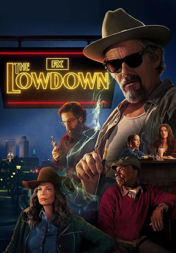
What Font is The Lowdown?
The title likely employs Deco Design JNL Regular, featuring streamlined Art Deco characteristics and commanding, crisp contours expressing refined boldness. Though commercial, we’ve discovered a free alternative mirroring its distinctive styling.
About The Lowdown
The Lowdown represents a 2025 American neo-noir crime drama production created by Sterlin Harjo, featuring Ethan Hawke as Lee Raybon, a Tulsa bookstore proprietor conducting investigative journalism. When his recent investigation intersects with questionable circumstances surrounding a prominent family member’s death, Lee becomes entangled in hazardous corruption networks and concealed relationships. The series merges pointed social observation with understated humor and atmospheric setting, showcasing notable supporting performances from Keith David and Jeanne Tripplehorn against Oklahoma’s distinctive landscapes.
Remember to respect the licensing agreements for every font. These fonts are offered free for personal projects, though some permit commercial applications as well. Check the accompanying Read Me document with your download for specific details. When unsure about permitted uses, reaching out directly to the font designer is always recommended.