

How to Train Your Dragon
What Font Does How to Train Your Dragon Use?
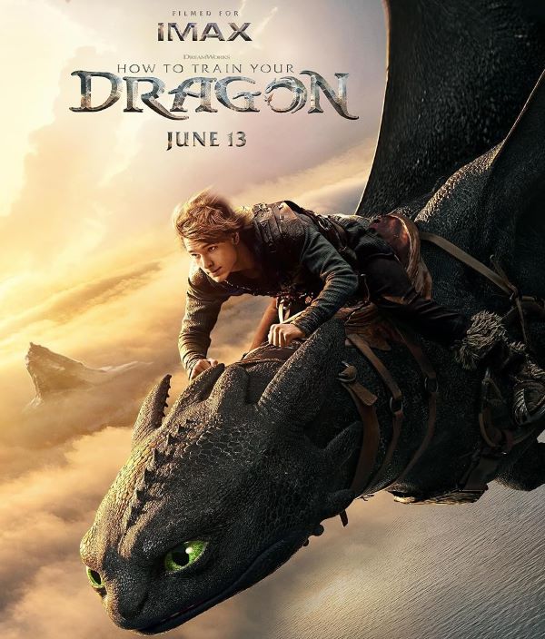
The typography featured in How to Train Your Dragon draws inspiration from fantasy lettering styles, with Pieces of Eight by Steve Ferrera serving as the closest approximation to the film’s title treatment. This typeface exhibits jagged, battle-worn serifs and a distinctly Norse aesthetic that aligns perfectly with the movie’s Viking setting and dragon-filled skies. The letterforms convey strength and mythology, embodying the adventurous spirit of Hiccup’s journey from outcast to dragon rider. Its rugged character design resonates with the film’s themes of courage and unlikely friendship. DreamWorks Animation’s 2010 masterpiece transformed dragon-human relationships from fear to understanding, and this typography choice reinforces that epic, legendary quality throughout the franchise.
Personal-use only. For commercial use please contact owner.
About How to Train Your Dragon
How to Train Your Dragon (2010) is an animated fantasy adventure film produced by DreamWorks Animation. It tells the story of Hiccup, a young Viking who befriends a dragon named Toothless, discovering that friendship can be more powerful than fear.